Usage
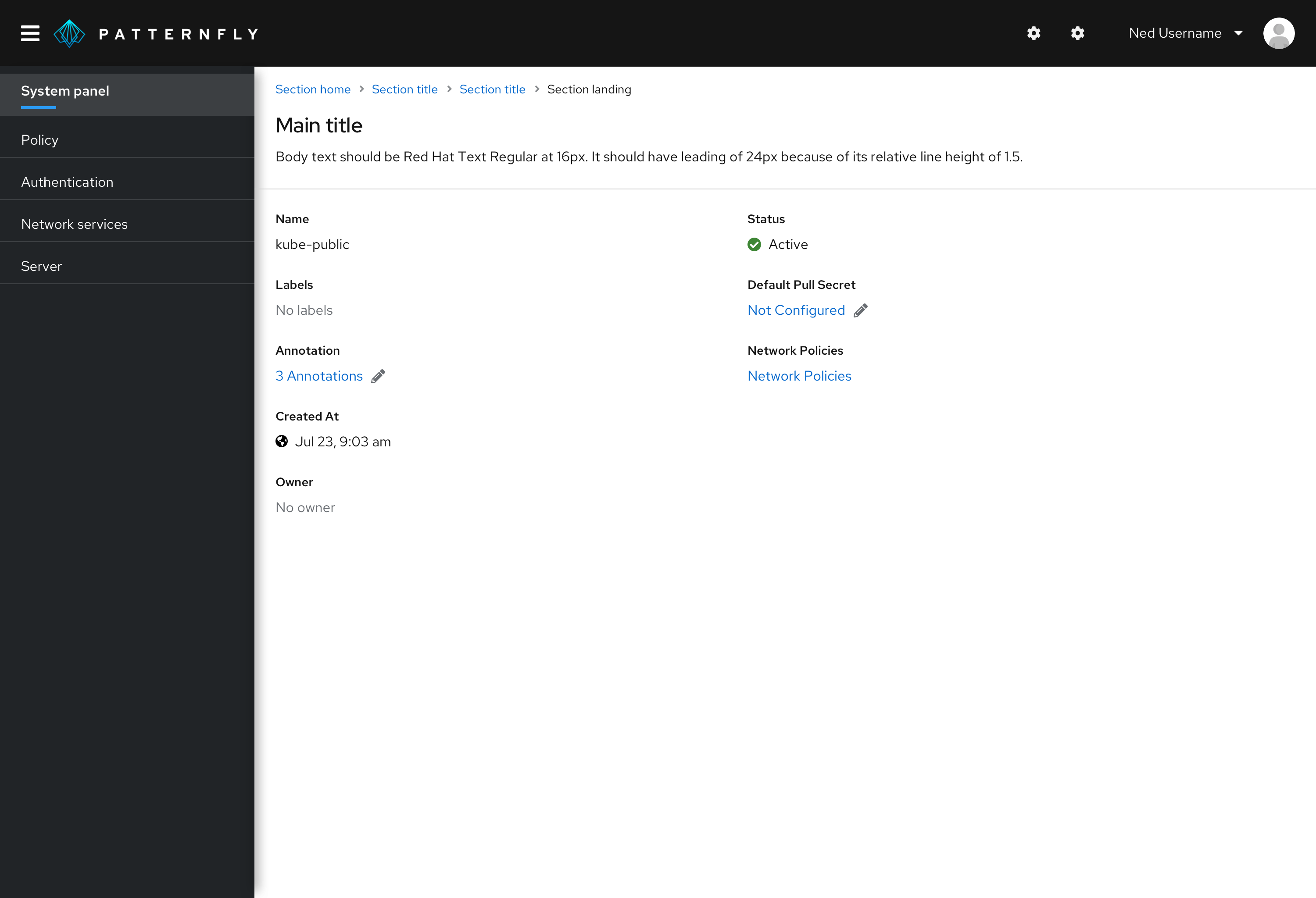
Use a description list when you have a set of terms and definitions related to a single item. The content within the definitions is not limited to only plain text. This component can be extremely useful in context of Detail pages for a certain resource or item.
Variations
Default
By default, the description list will be formatted so that the term stacks vertically above the description.
Horizontal
Description lists can also be horizontally formatted so that the term and description sit inline and the term comes before the description.
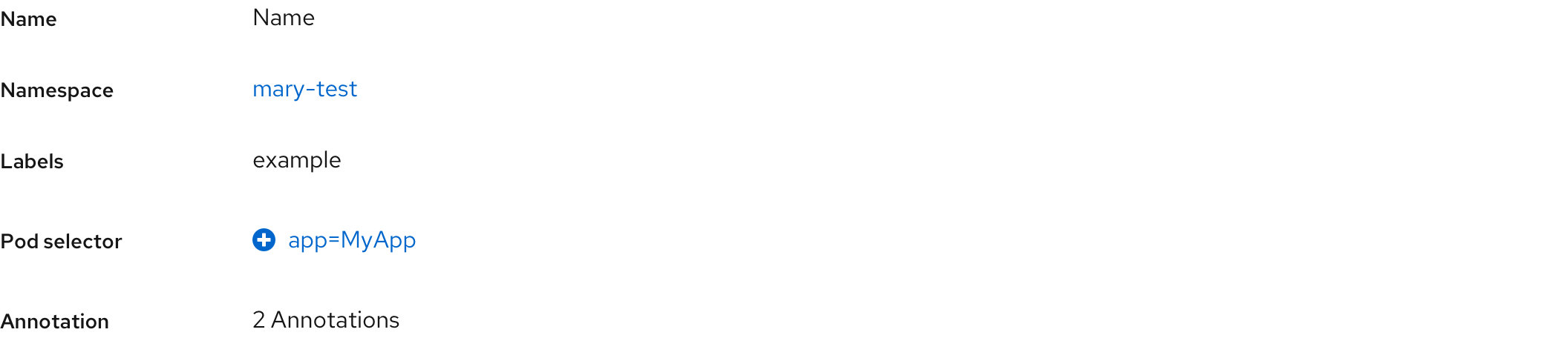
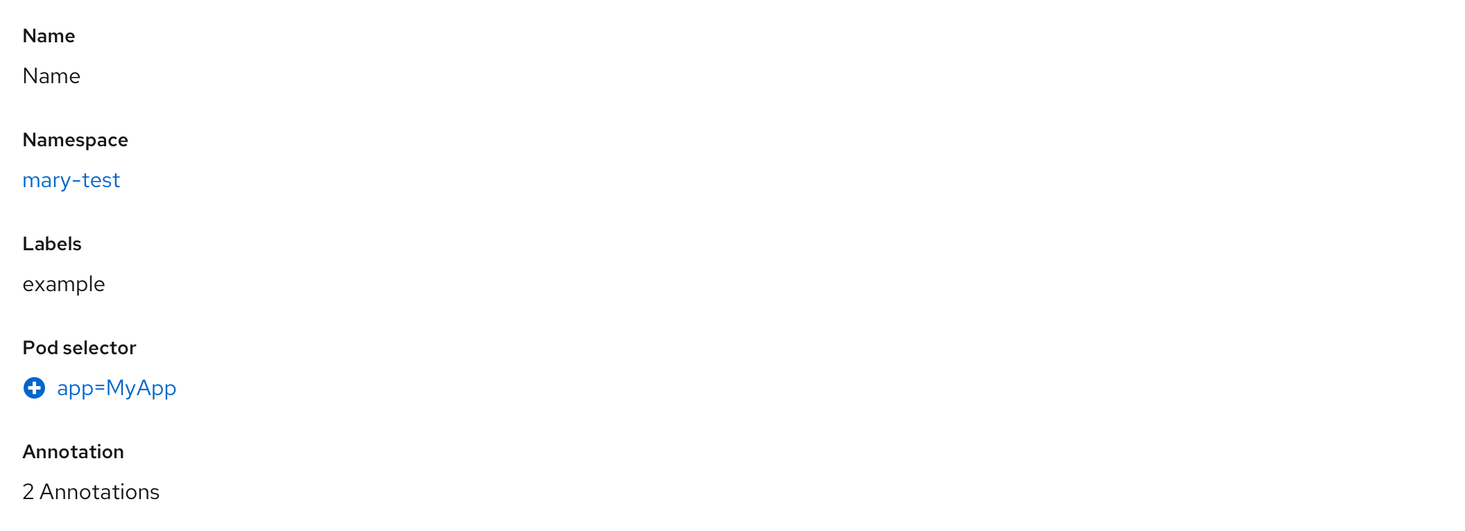
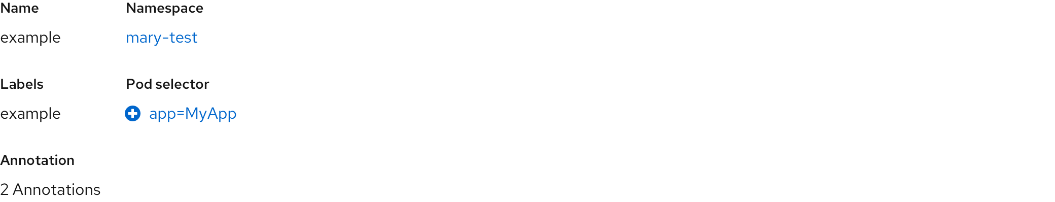
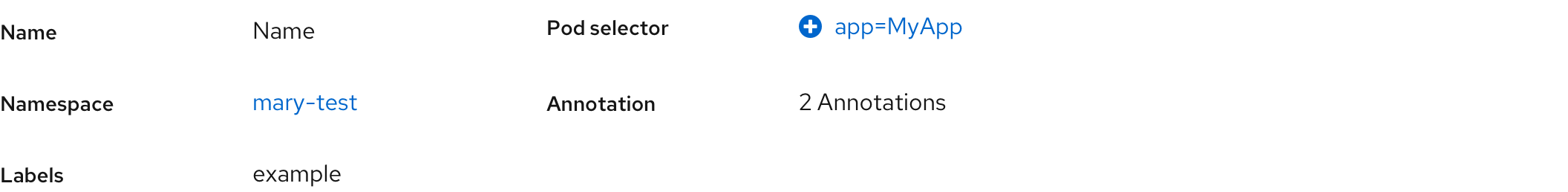
Using columns
Columns can be applied in both vertical and horizontal formats. By default, there will be 24px gutters within the column grid.
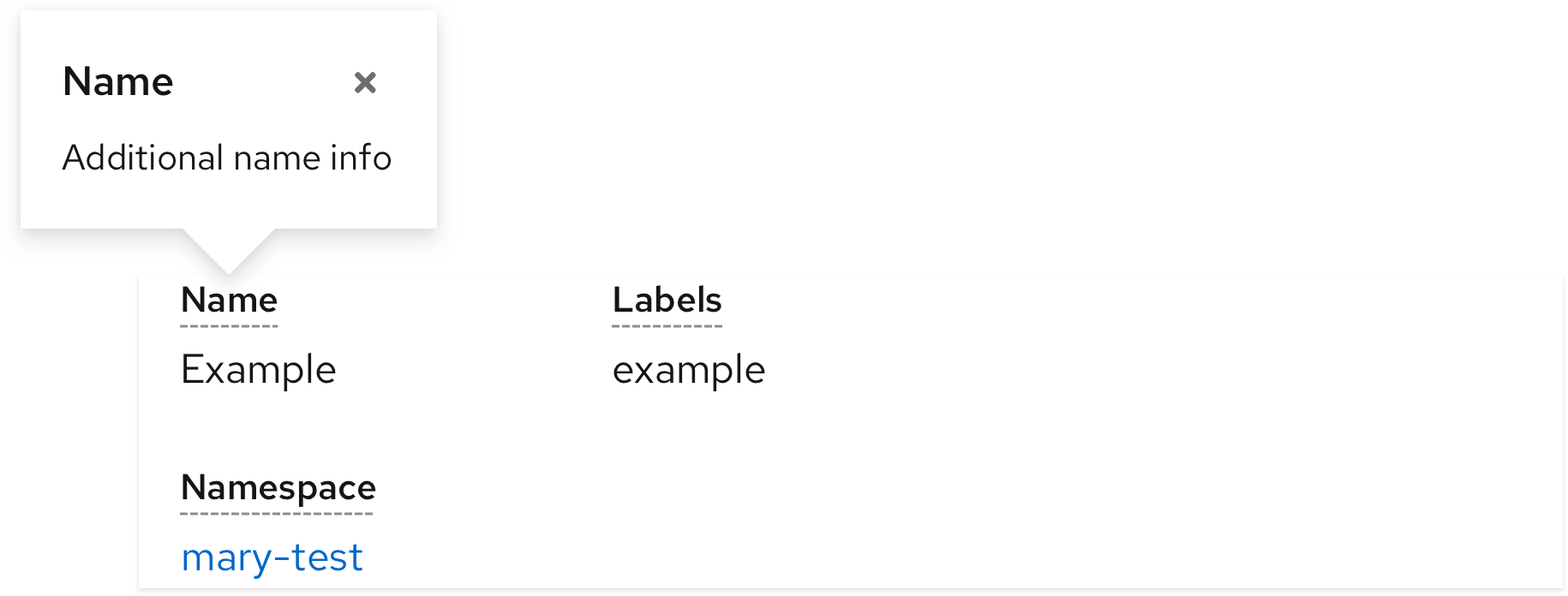
Term help text
To provide help text about a term in the description list, you may add popovers indicated by a dotted underline on the label. This is recommended in detailed lists where you have many popovers and using a blue link or icon would clutter the page.
View source on GitHub