Elements
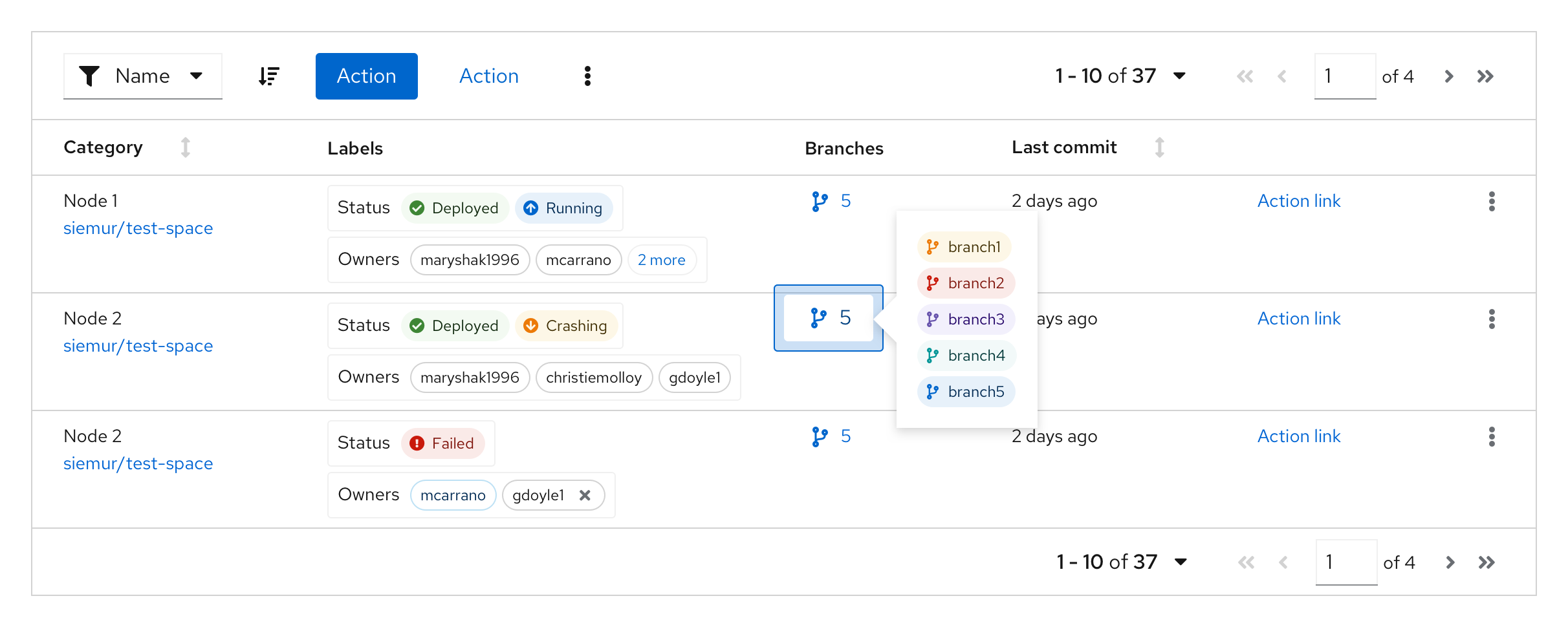
Label groups have a number of components to them.

- Label group (optional): indicates the group category
- Label: indicates the labels applied.
- Overflow: indicates if there are more labels to show.
- Group close (optional): deletes the entire label group.
Label groups can use various combinations of these features to build custom label groups.
Usage
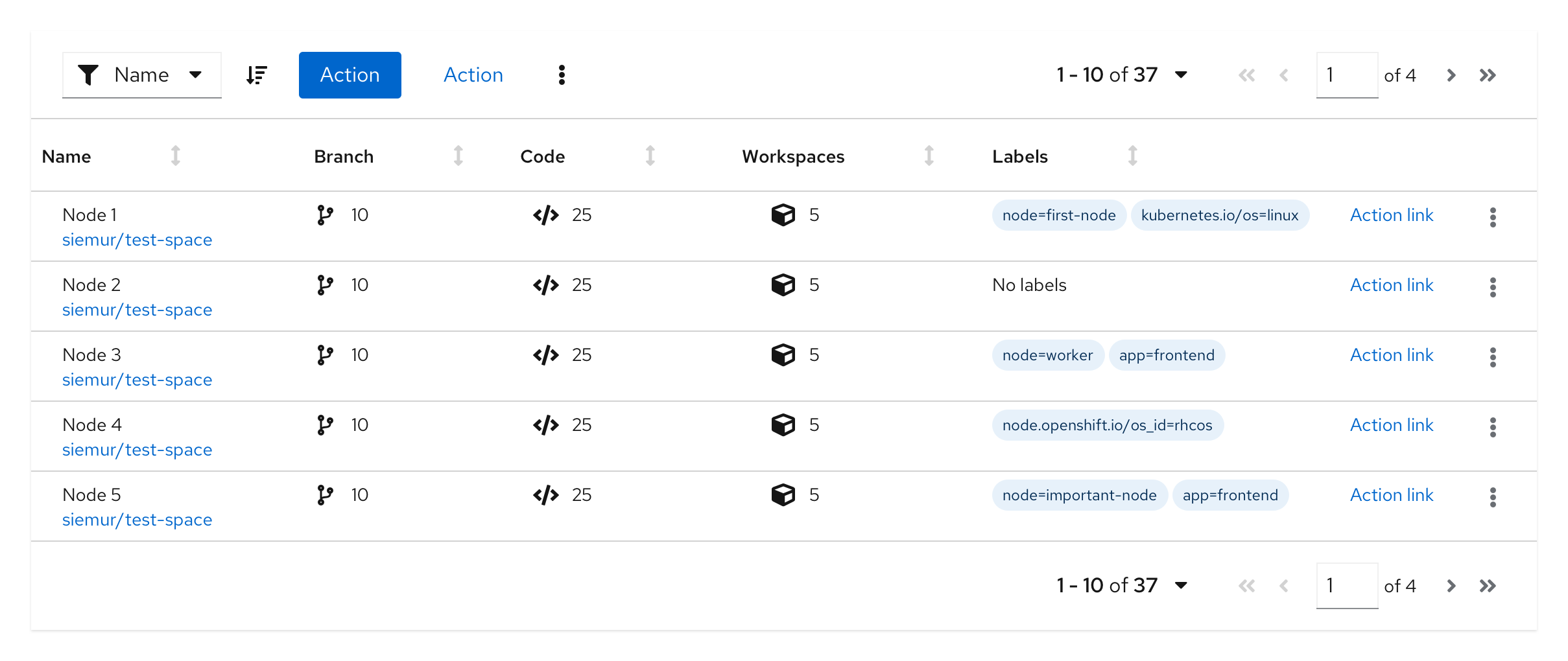
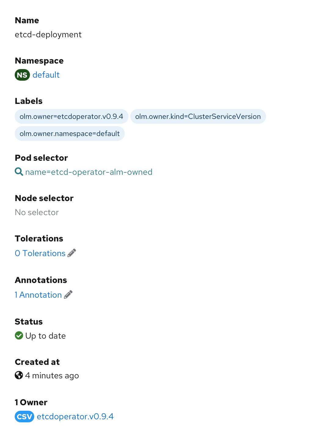
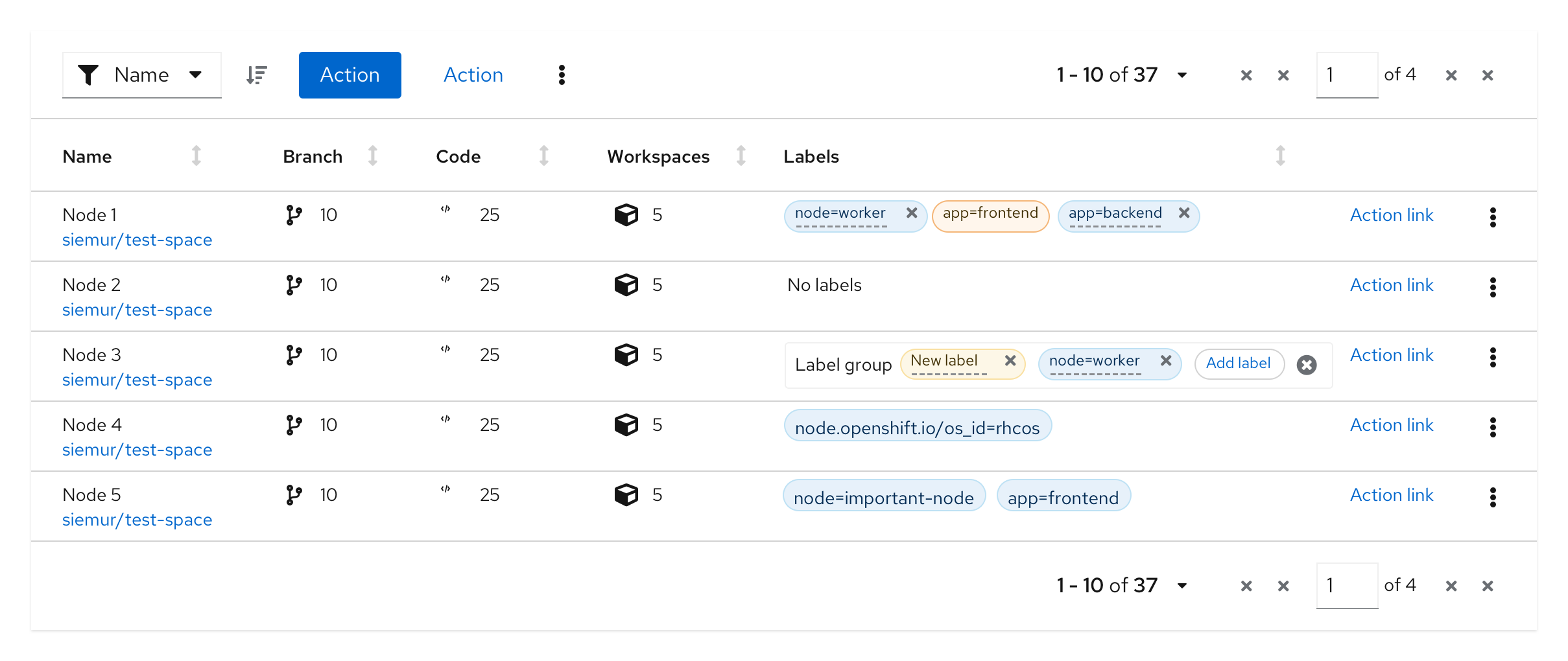
Label groups should be used when there are multiple labels assigned to a component. They can be used almost anywhere in a UI, but are commonly used in table views and description lists.
Label groups in a table
Label groups in a table popover
Label groups in a description list
Variations
Editable label group
Adding a new label to a group, without a group label
This variation can be used when there is a need to add a new label or edit an existing label within a label group, and the label group does not have a group label.
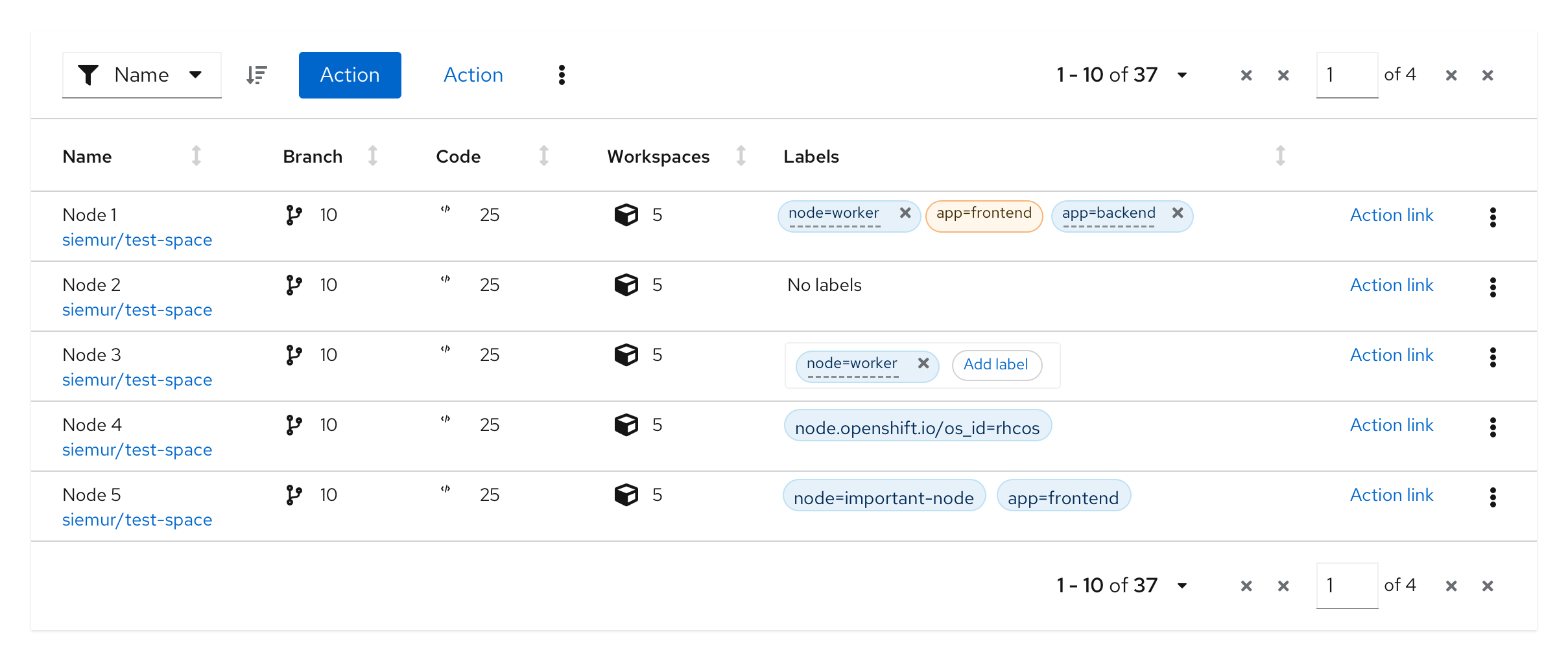
When the user selects the ‘Add label’ button, a new label is added as the first label in the group. Once the new label is added, the user can overwrite the default value by double clicking the label.

Adding a new label to a group, with a group label
This variation can be used when there is a need to add a new label within the label group, and the label group has a group label.

When the user selects the ‘Add label’ button, a new label is added as the first label in the group. Once the new label is added, the user can overwrite the default value by double clicking the label.
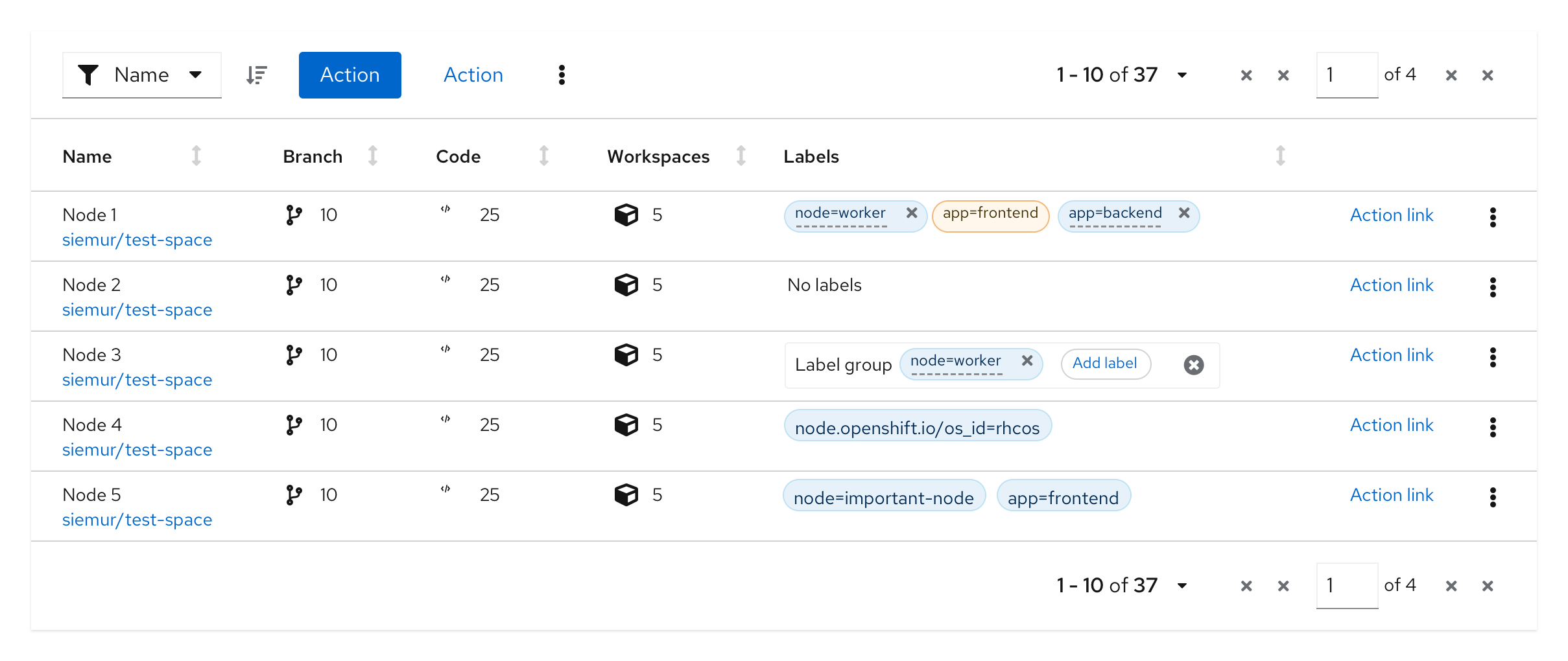
Adding a new label to a label group from a list of preselected labels
This variation can be used when only a fixed set of labels can be added to a label group.

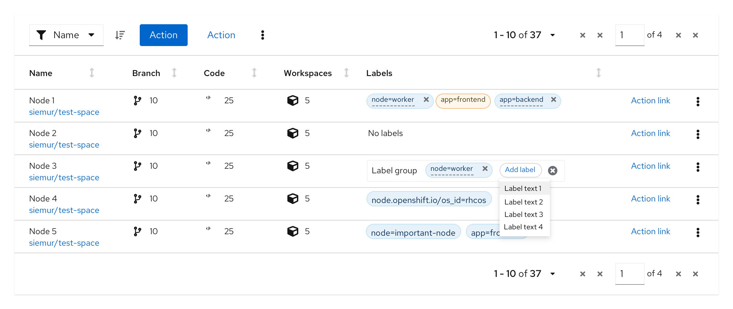
When the user selects the ‘Add label’ button, a drop list is displayed with the existing list of values. User selects a new label from the values in the drop list.
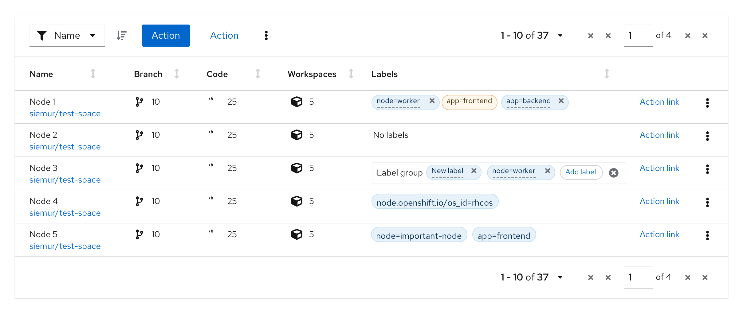
The new label is added with the selected value and can not be changed.

Adding a new custom label to a label group
This variation can be used when you want to allow users to customize the labels they add to a label group.
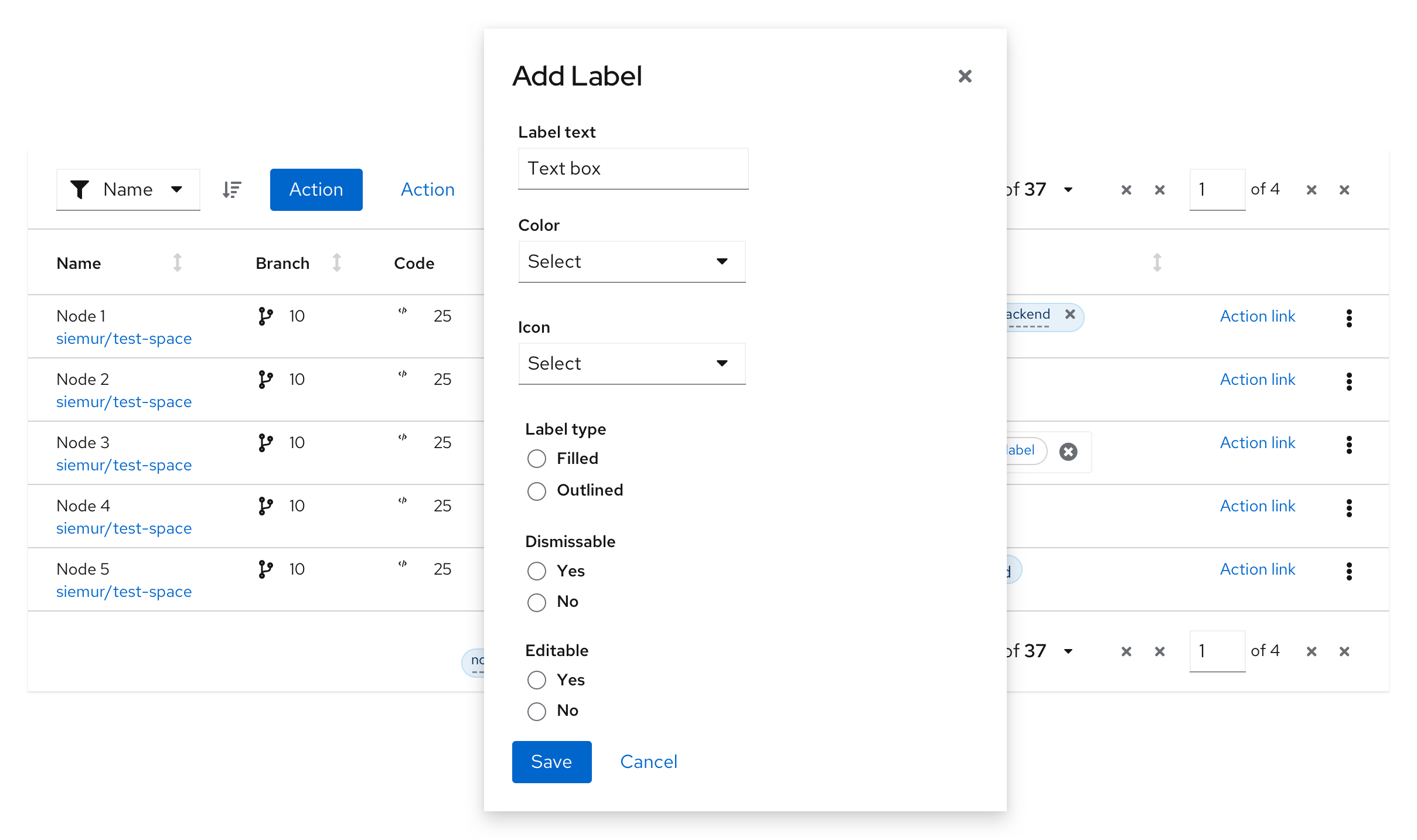
When the user selects the ‘Add label’ button, it opens up a modal from which they can select the attributes for the new label. These include label text, color, icon, filled vs outlined, ability to dismiss, and editability. The options shown can be customized to fit your use cases.
The new label is created based on the attributes selected by the user and it can not be changed.
View source on GitHub


