Usage
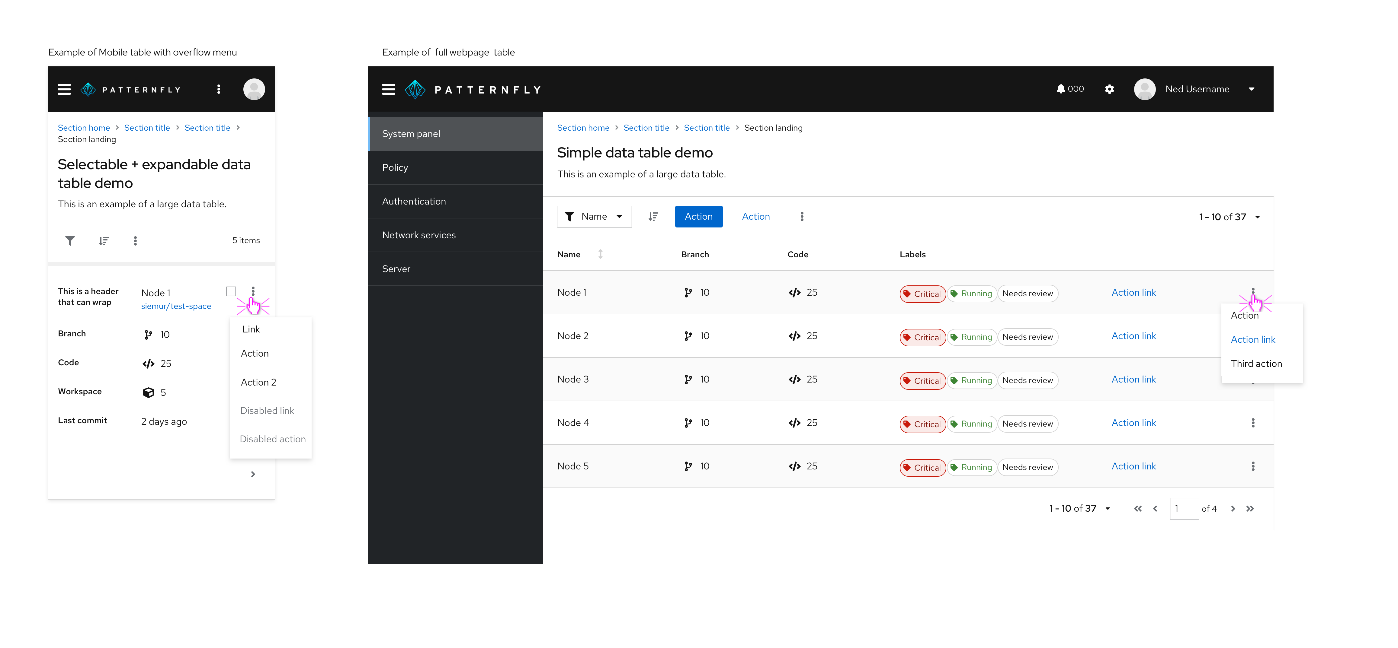
Use an overflow menu when additional options are available to the user but there is a space constraint. Common usage for overflow menu's happen when switching a UI from a desktop to a mobile device.
When to use
- Use an overflow menu in a table toolbar to group a number of actions and create visual space. Avoid having more than 3 actions fully displayed within a toolbar.

Use an overflow menu within a table row when additional actions are available that don’t correspond with a column header.

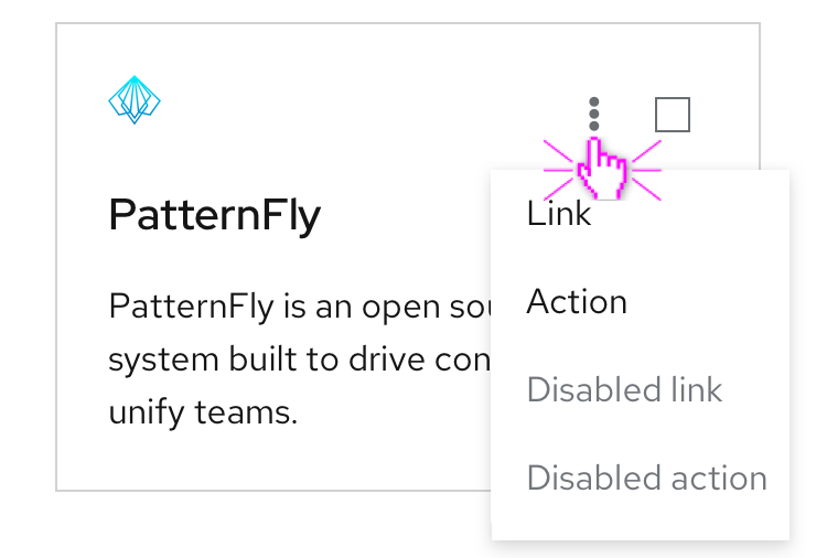
Use an overflow menu within a card component to present additional menu options or provide action links.

When not to use
- Do not use an overflow menu when there are 2 or fewer actions available to the user.
- Do not use in conjunction with label groups when there isn’t enough space to display each label. Instead, use an overflow label.
- Do not use an overflow menu to hide additional content that you dont want to be seen by default, instead use an expandable section.
Behavior
Overflow menus are represented by a kebab button, as the user clicks on the kebab, a horizontal list will appear with additional options to click.
Content Guidelines
- Text should be short and direct so users can quickly scan and decide on an action.
- Text should be written in sentence case.
- Overflow menus should be placed on the right side of the container.
View source on GitHub


