Skip to content
PatternFly logo

Panel

The panel component is a container that supports flexible content layouts. It can be used to house other components such as fields, forms, videos, buttons, and more. The panel should not be confused with the drawer component, which allows you to surface information via a collapsable container.

Usage

Panels are commonly used:

  • To provide more content structure through the UI.
  • To group content and components on a blank canvas.

Examples

The panel is used as a content block with a header, body, and footer.
A basic panel with a header, body and footer

The panel is used a dropdown menu for advanced search input.
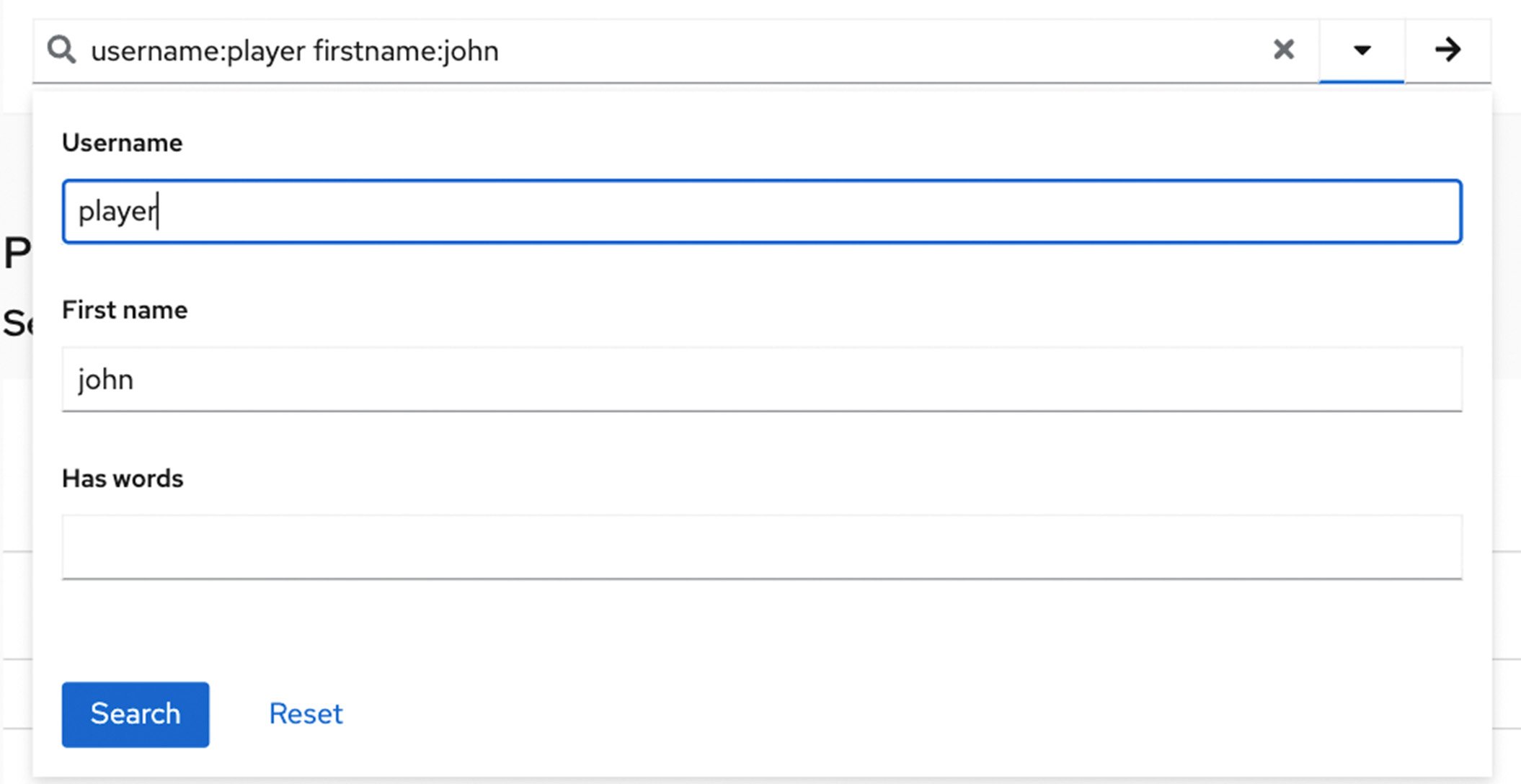
The panel is used a dropdown menu for advanced search input


View source on GitHub