Demos
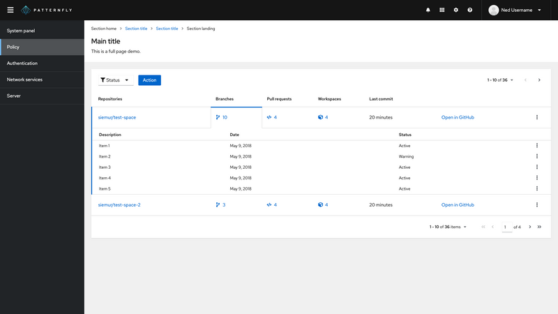
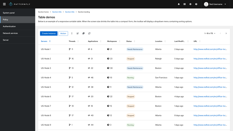
Column management with draggable
| Repositories | Branches | Pull requests | Workspaces | Last commit | |||
|---|---|---|---|---|---|---|---|
Node 1 siemur/test-space | 10 | 25 | 5 | 2 days ago | Action link | ||
Node 2 siemur/test-space | 8 | 30 | 2 | 2 days ago | Action link | ||
Node 3 siemur/test-space | 12 | 48 | 13 | 30 days ago | Action link | ||
Node 4 siemur/test-space | 3 | 8 | 20 | 8 days ago | Action link | ||
Node 5 siemur/test-space | 34 | 21 | 26 | 2 days ago | Action link |
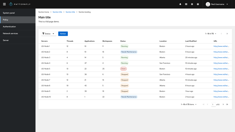
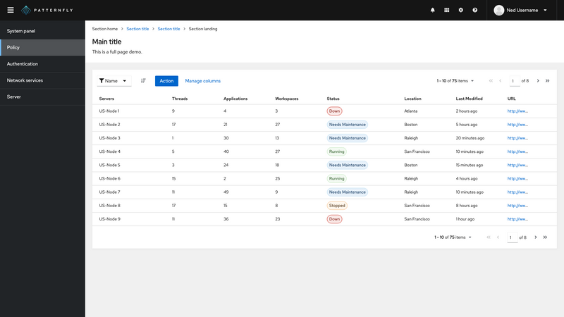
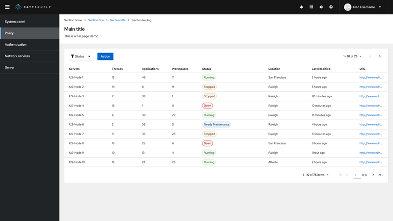
Filterable
| Servers | Threads | Applications | Workspaces | Status | Location | |
|---|---|---|---|---|---|---|
| US-Node 1 | 5 | 25 | 5 | Stopped | Raleigh | |
| US-Node 2 | 5 | 30 | 2 | Down | Westford | |
| US-Node 3 | 13 | 35 | 12 | Degraded | Boston | |
| US-Node 4 | 2 | 5 | 18 | Needs Maintainence | Raleigh | |
| US-Node 5 | 7 | 30 | 5 | Running | Boston | |
| US-Node 6 | 5 | 20 | 15 | Stopped | Raleigh | |
| CZ-Node 1 | 12 | 48 | 13 | Down | Brno | |
| CZ-Node 2 | 3 | 8 | 20 | Running | Brno | |
| CZ-Remote-Node 1 | 15 | 20 | 10 | Down | Brno | |
| Bangalore-Node 1 | 20 | 30 | 30 | Running | Bangalore |
Automatic pagination
The below example illustrates the defaultToFullPage prop, which makes the following changes when the user sets the number of items to display per page to an amount that exceeds the remaining amount of data:
- The component automatically changes the page back to the last full page of results, rather than defaulting to the final page of results.
To demonstrate this, navigate to the last page of data below using the >> navigation arrows, then use the dropdown selector to change the view to 5 per page.
- The default behavior would show the last page of results, which would only contain the last two rows (rows 11 - 12).
- The
defaultToFullPageprop navigates you back to the previous page which does contain a full page of 5 rows (rows 6 - 10).
| First column | Second column | Third column |
|---|---|---|
| Row 1 column 1 | Row 1 column 2 | Row 1 column 3 |
| Row 2 column 1 | Row 2 column 2 | Row 2 column 3 |
| Row 3 column 1 | Row 3 column 2 | Row 3 column 3 |
| Row 4 column 1 | Row 4 column 2 | Row 4 column 3 |
| Row 5 column 1 | Row 5 column 2 | Row 5 column 3 |
| Row 6 column 1 | Row 6 column 2 | Row 6 column 3 |
| Row 7 column 1 | Row 7 column 2 | Row 7 column 3 |
| Row 8 column 1 | Row 8 column 2 | Row 8 column 3 |
| Row 9 column 1 | Row 9 column 2 | Row 9 column 3 |
| Row 10 column 1 | Row 10 column 2 | Row 10 column 3 |
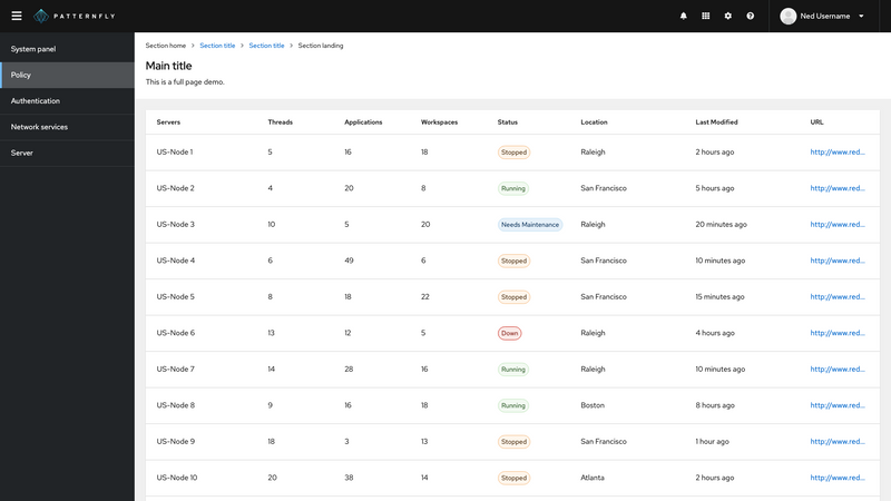
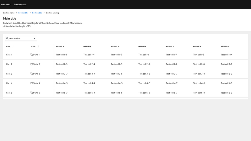
Sticky columns and header with toolbar
A toolbar may be added above a sticky table either inside or outside the OuterScrollContainer.
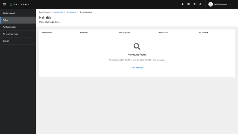
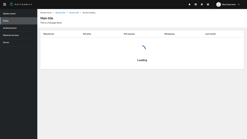
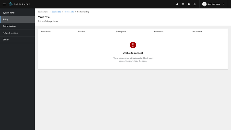
Empty states
These examples demonstrate the use of an Empty State component inside of a Table. Empty states are useful in a table when a filter returns no results, while data is loading, or when any type of error or exception condition occurs.
View source on GitHub

