Elements
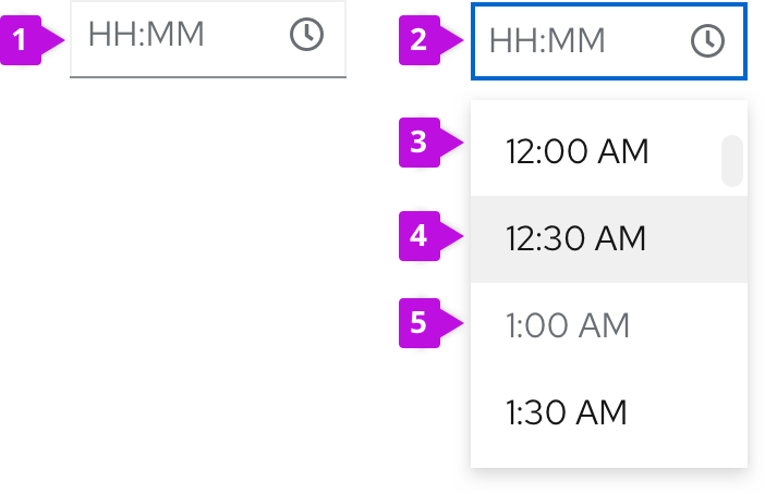
- Time field: Displays a user's selected time. Always fill the time field with a placeholder time format (HH:MM) or a pre-selected time. Users can choose a time by either typing in a time, or selecting one from the menu list of time options. The time field should never be empty.
- Time field in focused state: Indicates that menu list of time options is open.
- Menu: Contains a list of times in set increments, such as 12:00 AM to 11:30 PM in 30 minute increments.
- Menu item in hover state
- Menu item in disabled state
Usage
Use time pickers to enable users to select or input a time. For example, in a toolbar for item filtration, or in a form for scheduling inputs.
Single time selection
A time picker allows users to select a single time. When a user enters a new time in the time field, the new time automatically replaces any placeholder or previously-selected value in that input field.
Typically, time picker menus list selectable times in 30-minute increments. However, users always have the option to input any desired times that don't fall on the suggested time increments. For example, a user could type in 12:38 PM despite the list of options only showing 12:30 PM and 1:00 PM options.
For guidance on writing time formats for time pickers, see the content section.
Time range selection
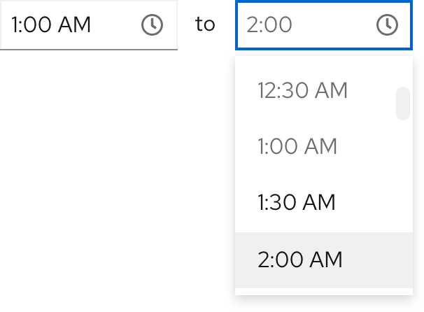
Two time pickers can be used together to specify a time range. The first one functions as a start (“from”) time and the second one functions as an end (“to”) time.

Until the user selects a start time, the end time field will be disabled.
Date and time range selection
Combine a date picker and time picker when you want users to select a range of times across multiple days.
For more information about using date and time pickers together, visit our date picker guidelines.
Variations
Time picker in a toolbar
Use time pickers as filters in a toolbar. Note that time pickers aren't commonly used on their own, and will usually be accompanied by a date picker.
See the date picker usage guidelines to learn more about using date pickers and time pickers in a toolbar.
Time picker in a form
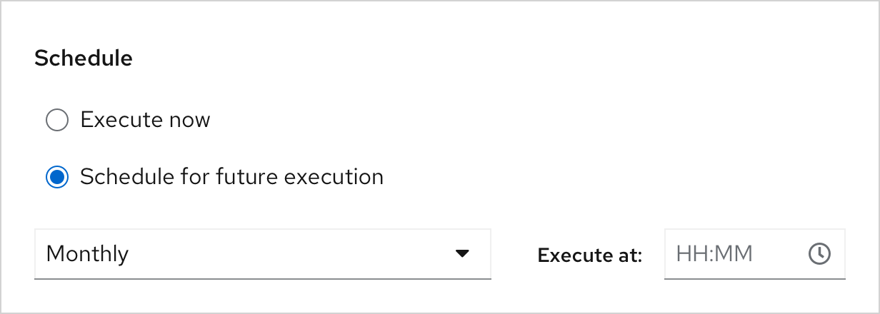
Use a time picker in a form to display basic scheduling options, typically for future events. In some use cases, you may preselect and display the most common time options users can choose from.
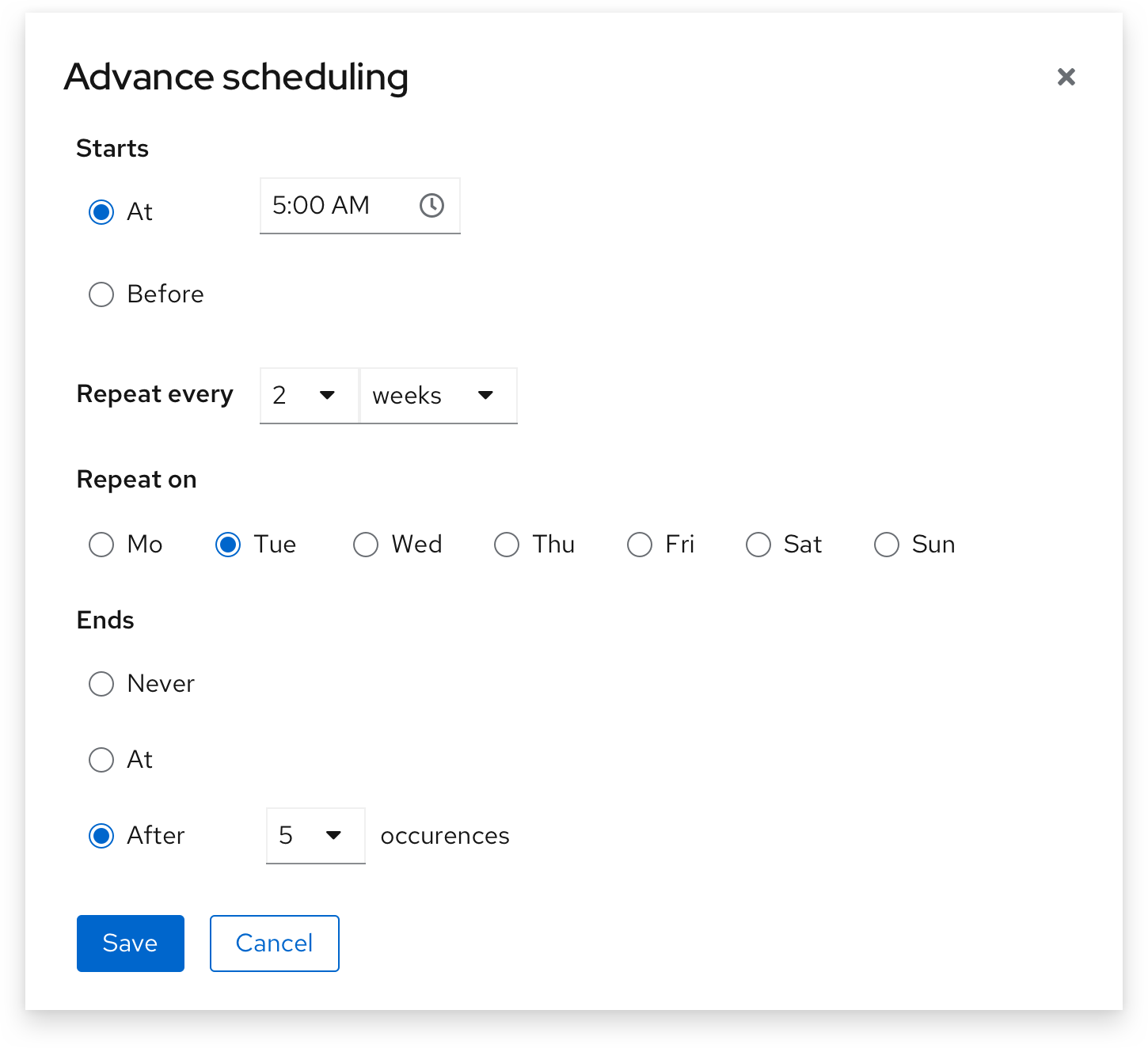
Some use cases will call for more advanced scheduling options, such as scheduling an action to take place at or before a certain time, repeat at a certain time interval, or end after a certain number of occurrences.
Time picker with time zones
Use variable checkboxes, radio buttons, dropdowns, or input fields to help users select their intended time based on their desired or current time zone.
For some use cases, users may wish to customize their time display or selection based on Universal Time Coordinated (UTC) or their own personal time zone. If applicable, add a time zone dropdown so that users can select their desired time zone from a series of options.

Learn more about formatting and displaying time zones in our date and time guidelines.
Content considerations
Time format
Time formats are product-specific and often depend on user locale. To minimize confusion, choose one time format and keep it consistent. If one time picker displays HH:MM, be sure to repeat the same format throughout your interface.
Learn more about date and time best practices in our date and time guidelines.
Placeholder text
Always use placeholder text in time fields to provide an example of the accepted time format. Placeholder text will disappear after users begin inputting their own time.
Example: HH:MM

For more information about writing effective placeholder text, see our form design guidelines.
Helper text
Use helper text to provide permanent guidance below the time field.
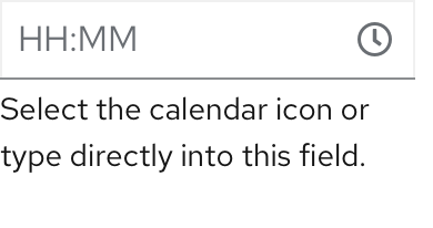
For more information about writing effective inline help, see our form design guidelines.
Error messages
Use field level error messages to alert users when their inputted time or time format is invalid. Always specify what went wrong so that users can quickly identify the problem and fix it.
Examples:
- Select a time within valid range.
- Enter a valid time: HH:MM

For more information about writing effective error messages, see our UX writing style guide.
View source on GitHub


