Elements

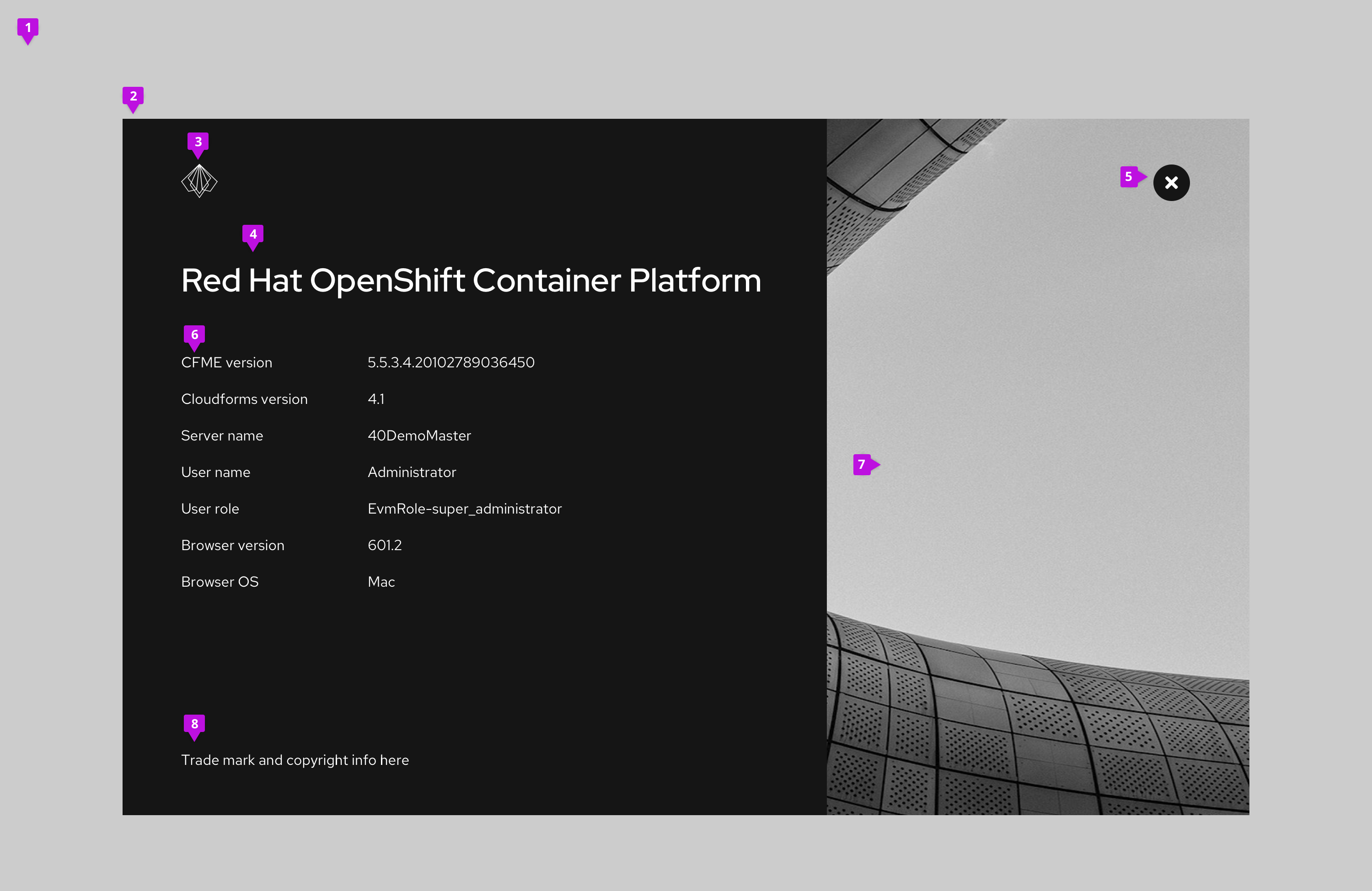
- Backdrop: Blurs any interface elements in the background to bring the modal content into focus
- Modal
- Branding: Provides logo and branding for the product. Substitute your own logotype by providing an SVG that can be scaled proportionately to fit the space.
- Product title
- Close button
- Content: Label and version
- When version and build information are both shown: Version 6.3 (Build 5)
- When version only: Version 6.3
- When build only: Build 5
- Modal image: The modal image should be the same as the background image you use for your application.
- Trademark and copyright information: Optionally include legal text. Suggested format for copyright - Copyright (c) 2018 Company
Usage
Use an about modal to provide information about a product including the product name, logo, version numbers, and any appropriate legal text.
Behavior
About modals are clicked into through a users interaction with a button, link, or icon component. When the modal is launched, the user can only see content inside it, until clicking the close button.
Accessing the about modal
Provide access to an about modal using a help icon in the application masthead. Clicking the help icon will launch a dropdown menu. The help menu should always include an option labeled "About" that launches the about modal.

View source on GitHub


