Modal dialog
Use modal dialogs load and display important information without navigating away from the current page.
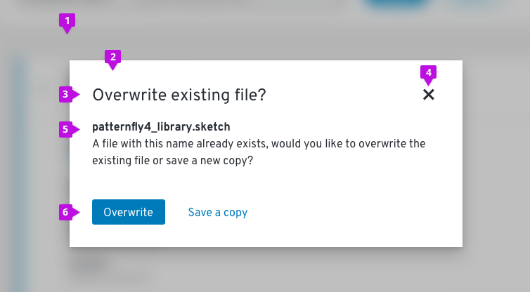
Primary elements

- Backdrop
- Modal box
- Title: Concisely convey the purpose of the modal.
- Close
- Content area
- Buttons: Enable a user to confirm, submit, or exit. Modal dialogs can include multiple action buttons, but should be limited to one primary button
Usage
When to use
Use a modal dialog when information is critical and requires user input or attention. Use modals to:
- Validate user decisions
- Report errors
- Provide the result of a task or state of an application
- Get required user input
When not to use
Modal dialogs interrupt user task flow and should be avoided for any information that is not critical to user success.
Types of modals
Get confirmation
Use a confirmation dialog to validate user decisions and communicate consequences. Confirmation dialogs need to clearly restate the action the user is trying to take and explicitly outline the consequences of that action.
Note: Since confirmation dialogs disrupt user task flow, do not provide confirmation dialogs for actions that are easily reversed or insignificant.
Confirm a non-destructive action
 Provide buttons on confirmation dialogs that make it simple for users to understand and confirm their choices. When choosing button labels, use descriptive verbs that clearly indicate the consequence of a selection, like Delete, Save, or Create. Avoid vague labels like OK or Done.
Ambiguous title and button labels make it more difficult for the user to understand their options and make a decision. Descriptive title and button labels make it easy for the user to scan the content and make a decision quickly.
Confirm a destructive action
 If an action is difficult or impossible to undo, a warning icon can be incorporated into the modal to add emphasis. If an action will seriously impact the system and cannot be undone, use a destructive style button. Otherwise, use a primary button.
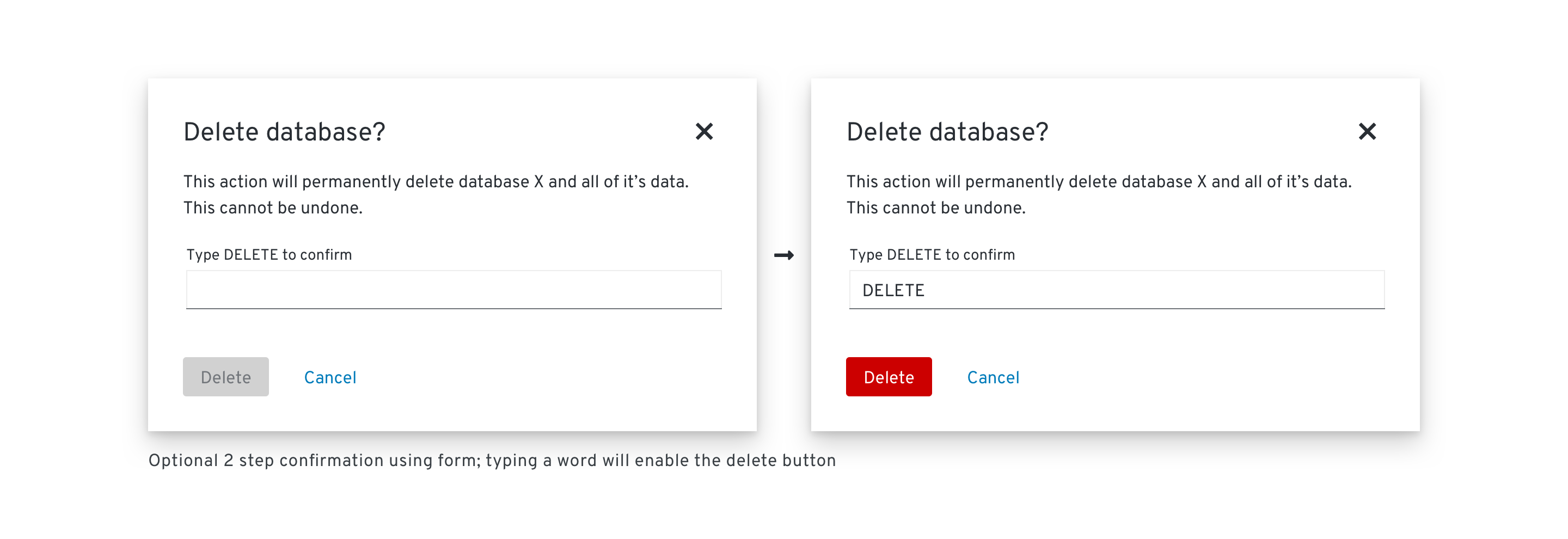
Sometimes it is necessary to require an additional confirmation with a destructive action. An example using a form field can be seen below. In order for the destructive action to become actionable, the user needs to type in a word or phrase to make the button active.

Report errors
 Use error dialogs to inform users of problems interrupting normal or expected behavior.
An error message should be actionable, human readable, and answer the following questions:
- What is the problem?
- Why did it happen?
- How can I fix it?
Never blame the user. Use passive voice where appropriate to avoid assigning blame.
- ⛔ You put in the wrong password.
- ✅ That password wasn’t recognized OR
- ✅ We didn’t recognize that password.
Provide the result of a task or state of an application
 Use passive dialogs to communicate critical information like the status of an application or result of an action. The content of a passive dialog should be important, immediately relevant, and either lead to or require action on the user’s part.
Some usage examples include:
- Notifying a user that an operation may take a long time to complete
- Notifying a user that a critical process is complete
Note: If information is not critical, don’t use a passive dialog. Instead, use inline notifications or toast notifications.
Get required user input
Sometimes users may need to provide additional input in order to complete an action. In this situation a form or other type of element may be incorporated into the modal. An example of this use case is the modal wizard.
Content
Clearly restate the action the user is trying to take and explicitly outline the consequences of that action.
Provide button labels that make it simple for users to understand and confirm their choices. Use descriptive verbs that clearly indicate the consequence of a selection, like Delete, Save, or Create. Avoid vague labels like OK or Done.
Use descriptive title and button labels so the user can scan content and make a decision quickly. Ambiguous title and button labels make it more difficult for the user to understand their options and make a decision.
If the modal needs to convey the importance of information visually, icons can be added.
See our content guidelines for additional guidance.
Icon use in modal dialogs
| Icon | Use case(s) | Usage |
|---|---|---|
| Warning: Caution/ Warning | Use on confirmation dialogs or passive dialogs to indicate a higher level of urgency and importance. | |
| Critical Warning: Information will be deleted/permanent action | Use on confirmation dialogs or passive dialogs to indicate the highest level of urgency and importance. | |
| Error: Alert the user that there has been a critical failure/error. | Use on error dialogs to indicate a problem. | |
| Acknowledgement: Inform the user of an action or result | Use on confirmation or passive dialogs to indicate a lower level of urgency. |
Components and demos used
The PatternFly components listed in the following sections can be used in a number of ways to suit specific needs or use-cases. We’ll explore several examples in this documentation.
HTML/CSS components
React components
